My name is Emily Blank and my first semester of a college student is over! It's hard to believe. This website summarizes the semester in Electronic Publishing and Design. There are all kinds of XHTML codes going into this website and even some examples of what I made in InDesign earlier on.
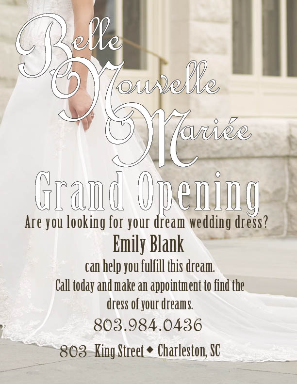
I think my design on the business flyer measured up to most of the desing principles and elements. The flyer has a variety of fonts as well as colors. There is asymmetrical balance with the dress on the left in the background. The font of the name "Belle Nouvelle Mariee" is visuallyappealing with the white lettering and a somewhat thick top stroke. The background is the bottom half of a woman in a beautiful wedding gown with her engagement ring showing. The opacity makes the words on top of it remain readable. The dark front with no stroke gives the details of the shop. These details need to be clearly read on the flyer, so they are. The message to the audience is to call Emily Blank to find your dream wedding dress. The phone number is larger than other fonts to make it stand out more. I used this particular font for the shop name because it is elegant, as are wedding dresses. It can also relate to royalty and ranciness and every bride wants to feel like a princess.
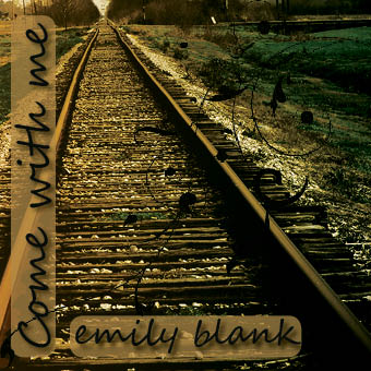
This particular design includes many effects. The boxes behindthe words have rounded corners and the opacity was lowered. The floral swirl adds a "girly feel" for the cover rather than just having a rugged train track. The design does measure up to most of the design principles and elements. The fonts are visually appealing, especially witht he drop shadow. The fonts are in black with a slightly opague background so that they are easy to read. The title "Come with me" ties in with the railroad track. The train track looks like it leads into oblivion and the singer wants someone to go with her. The design on the cover definitely catches the audience's attention- specifically southern girls. I came up with the name of the album frist and I've seen cute portraits of people on railroad tracks so I decided to include the extended railroad track on the cover. The swirl ads and extra visual image so that the photo of the railroad track doesn't look so plain.
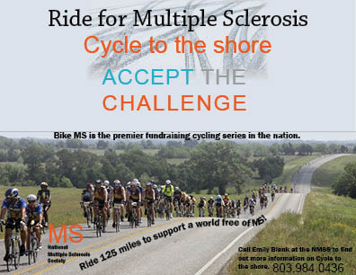
This specific promotional ad measures up to the design principles and elements. There are a few different fonts and a few different colors. There are also two different images. This ad is very visually appealing. The bikers at the bottom, extending to the horizon are an eye-catching picture. The tire tracks behind the headline are just enough to catch the reader's attention but not enough to take away from the words. The other words are written in black to show up against the biking photo. I incorporated the pen tool and then typed on the path that the bikers are on. The logo of the NMSS is in the bottom left corner, reminding the viewers of the reason for the bike ride. I blended the biking picture with a light blue gradient to match the sky. The overall look of the ad is effective and attractive.
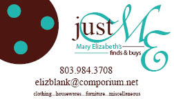
I made this business card for my mom's newly found business a few months ago. She does everything herself, therefore it's called "Just ME" but her name is Mary Elizabeth so the "ME" has a double meaning. The 3 turquoise dots represent her 3 children.